Need Finding
Watching how people do things is a great way to learn their goals and values, and come up with design insight. We call this needfinding. This assignment helps you train your eyes and ears to come up with design ideas. Your goal is to uncover user needs, breakdowns, clever hacks, and opportunities for improvement.
Glance's design brief
Begin by selecting a specific activity to observe.
I've choose the Glance's design brief to my observation. I've observed three different people interacting with their mobile phones. My interest was to know what are their favourite apps, how where they dispose at the different windows and how the users interact when the mobile when they receive a notification of a new email or message/post in a social network. The idea is to improve how the alerts and messages are shown to the user making more easy an intuitive the way the user interact with then.
Describe how three people performed an activity related to the brief you chose
- Select three individuals not similar to yourself to observe.
- Your goal is to observe the successes, breakdowns, and latent opportunities that occur when computers are used, not used, or could be used to support your chosen activity.
- Ask them to participate in this assignment and get permission from them. Be sure you coordinate with your participants to select a time that will be rich for observations.
- Tell the participants to perform the task as realistically as possible, while communicating to you as appropriate.
- During the observation, in addition to taking notes, try to use digital photographs if possible to document activities (but do not use a video camera).
- After the observations, spend 10 to 15 minutes interviewing your participants about the activity you observed.
-
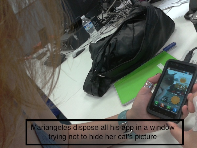
User 1
- Name:
- Mariángeles
- Mobile Device:
- LG
- Operative System:
- Android
Mariángeles is on his 30s. She uses a lot the mobile phone with a continuous connection to internet. Her most important app is WhatsApp. He has this app alone at the first window of his mobile. For her is very important when he reorder his apps that they don't hidden his wallpaper (a picture of his cat). For that reason she only dispose 3 apps at the bottom of each window. He has a lot of app divided at a large number of windows and organised by different themes (Social networks, mail, RSS Feeds...)
The sports and games apps are also important and they are grouped in two different folders.
When she receive a notification from mail, RSS or network the appear at the top of the window and he has to display the notification panel to see a resume of them.
At the time I was observe a large amount of notifications arrive at the status bar and it was difficult to recognize at first sight what kind of message is without enter at the notification panel.
-
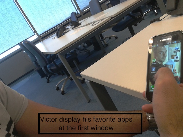
User 2
- Name:
- Víctor
- Mobile Device:
- Samsung
- Operative System:
- Android
Victor is at his first 30s. He uses a lot the mobile phone with a continuous connection to internet. Her most important app is WhatsApp. He has this app at the first window of his mobile. At the first window there are also Facebook an Google Maps Applications, and the movile camera.
The rest of the app aren't organiced in any way and the are disposed filling different windows.
He has the same problem that Mariáneles when he receive too much notification at the status bar and he find hard to identify the different messages without enter at the notification panel. For his is also tedious that when he make click to an email, for example, the mobile web navigator is automatically open to see on the original web the message.
-
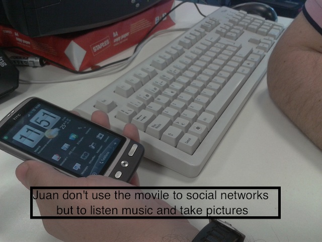
User 3
- Name:
- Juan
- Mobile Device:
- HTC
- Operative System:
- Android
Juan is at his 40s. He doesn't use the mobile phone with interact at social networks. At the first window he has the app that he use regularly: Mobile Contacts, Calls Historial, Lanter, SMS, Voice Recorder, Video Recorder and Photo Camera.
At the second window he has a mazimixe calendar and at the rest of windows hi dispose the apps without any order.
He listen music with the movile device but not online. He has a lot of mp3 and he use a pay app to listen then (WimpAmp)
He use also the movile to read ebooks.
To navegate for the different windows and apps he don't use the tactil display he prefers an optic button, similar to the blackberry central button.
Write a list of needs/goals/tasks inspired by what you observed
After observing people, go over your findings and use them to brainstorm a list specific user needs: opportunities for design innovation that would enable computers to better support the activity you observed. All ideas are good ones at this stage.
You are not looking for solutions yet: focus on user needs and goals only.
- If there are a lot of messages at the status bar they appear all packed together with a number that hide the app icon. It's hard to reconize what is the app than is sending us the message without scroll the panel. The Goal is to know what the is the app at first sight.
- If there are too much apps and windows Its hard to know ehere an app is. We need a way to know where an app is. (Solution: index, search...)
- There are some apps more important than others to the use. ¿How can we make real this difference allowing icon's different sizes?
- When a message for a social network arrive with a image is neccessary to surf the web to see this. The need is to see the image with the messaje.
- The users only can navegate horizontally between the different windows and could be more easy to him navegate vertically.
- Each window only allow a determinate number or app in realtion with the size of the window, 12 apps is the average number. The user would prefer to have all his apps in a simple window and scroll vertically.
- Sometimes, the users could prefer to open an app by voice.
- Some apps are more used than others. The user whant to know a first glanze what are this apps.
- Juan use his mp3 app a lot. He want to open his mp3 app automatically when he plug his earphones at the audio jack of the mobile phone.
Existing designs (inspirations) that relate to your thinking
Find inspiration for the solutions you will be brainstorming in the next assignment. Inspiration can be existing applications, artifacts, products, or services that relate to your concept. It may be that a carrot-peeler or a measuring cup is your inspiration for an elegant and ergonomic software interface design. You may be inspired to improve upon an existing service or go in a totally different direction. Cast the net wide and find as much as you can.
-
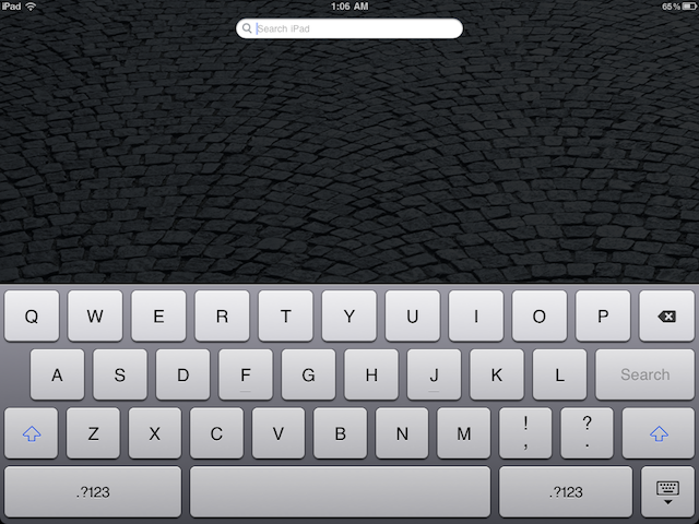
iPad search tool
They need to express the goal to find an app by a search of an index. iPad has a powerfull tool to search apps or documents.
-
Touch Points Android UI
Could be interesting to thing out ot the box and forget about how we enter always in an app; making click. Fjord Design Studio is working in a new User Interface for Android based in something called Touch Points, where the information come to the user.
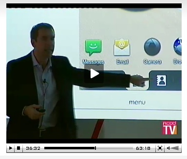
Optimizing Android User Experience: A Case Study in Mobile UI Design
-
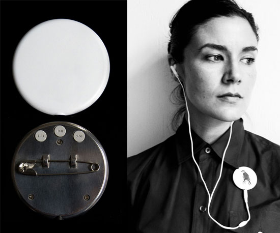
Playbutton
Playbutton is a gadget to lisen mp3 where use is related with the need of Juan at point 9. To operate the Playbutton so simply plug in yours and the device will automatically start playing. Unplug your headphones and it will stop playing.
-
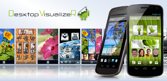
Desktop Visualizer
Desktop Visualizer makes shortcuts or widgets with the image specified or the icon of another application for the Home screen. You can change the icon when you create a shortcut.