Ready for Testing
Test, remodel, remake and test again.
Alternative Design
Select ONE component of your prototype and come up with a redesign for that part. Spend a couple hours at most on this. The change that you make should be small, but still not trivial. Ideally, the change should let you understand user needs better when compared against original prototype.
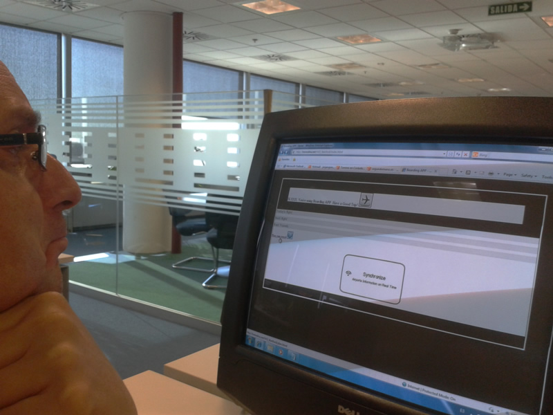
The Heuristic evaluation and the user test showed me that the "plan your travel" option was bad positioned at the index window. I've implemented a funtional prototype where this link has been moved to the botton of the app window to the top of the accordion.
- The original prototype that I tested
- The new prototype after the redesign
the change makes prototype difficult to use.
Peer Feedback
Hard to say a new "fully functional alternate" has been "created". A link simply moved position -- and I doubt it is clearer now, but a user test should have brought that to light.
Peer Feedback
Execute
-
Testing the app with user 1
-
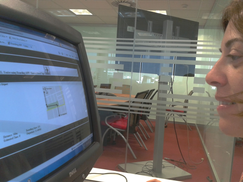
Testing the app with user 2
-
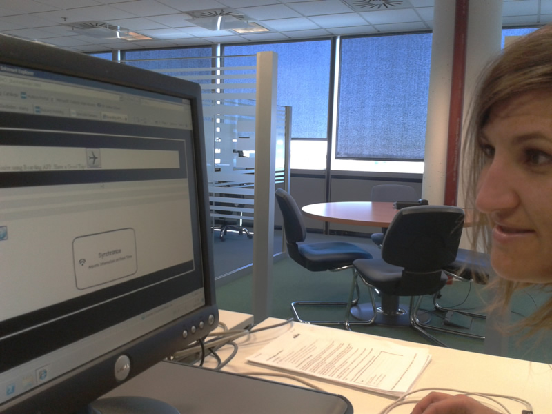
Testing the app with user 3
Summary of findings
- The "Help" button is too near to the "plan your travel link" an one user had problems to find it.
- Two users had problems to understand how to comeback to the home app without use the comeback button at the browser.
- At the airport window, the information of "Estimated Time" is confuse for one user.
- One user has comented that the information displayed when viewing next flights is not enough.
Good observation and reflection
Peer Feedback
Analyze
List changes you would implement in your next iteration to see what you learned from your experiments. For each change, include a brief explanation for why you selected it.
- To move the "Plan Your travel" link at the first position of the accordion. It's the logical position where the users search for it.
- Change the image of the airplane at the logo app because is not clear that it could be use to comeback to the first window of the app.
- When you enter in a "next flight" include in it the same information that appear at past flights window. Then the user could see at first glance the information.
- At airport window, change " Estimated Time: x' " for " Estimated Time: 8min. " . Not anybody could understand that a simple quotation mark is the same as minute.
Some good changes, but perhaps could go further
Peer Feedback
Valid changes
Peer Feedback